Brand your manuals
Manuscrio applies customer identity to its standard print design without turning every export into a custom template project.
Use the Site Build logo
Section titled “Use the Site Build logo”By default, Manuscrio uses the logo found in the site’s own navbar. It appears in the cover’s brand position and in the running header. inspect reports the discovered logo in its logo field; an empty value means none was found, and the manual carries the Manuscrio wordmark instead.
A navbar logo is often small. For a cover it is worth passing a higher-resolution asset even when discovery found something usable.
For a larger or print-specific asset, name one with --logo:
manuscrio-pdf export ./build --logo brand/logo.svgChoose an accent
Section titled “Choose an accent”--theme accepts one of five named print themes:
ink— uncolored and the default.lapismalachitegarnetamethyst
manuscrio-pdf export ./build --theme lapisThe same chapter opening, exported five times:
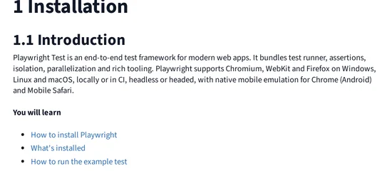
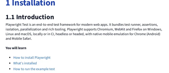
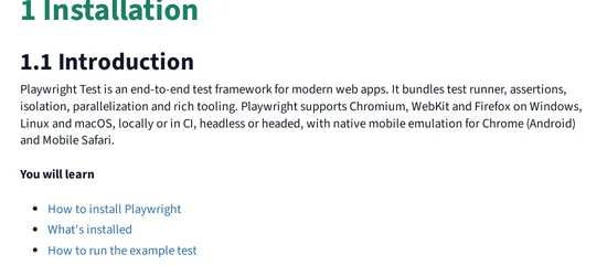
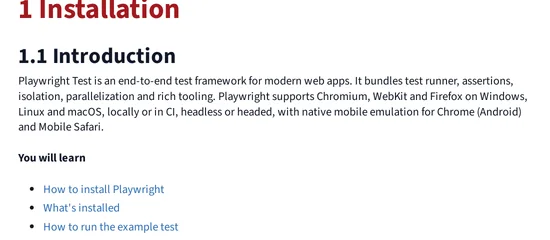
Only the chapter number and title move. Body text, headings, code, and tables are the same in all five, which is what keeps the accent a choice rather than a redesign.
The accent is reserved for top-level chapter titles and the contents table’s top level. Hierarchy does not depend on color, so the manual remains legible in greyscale.